RenoTahoe Tourism
Role: Art Director & Designer
CD/AD: Katelyn Tierney/Kevin Kriehn CD/CW: Nick Pipitone CW: Sam Smith
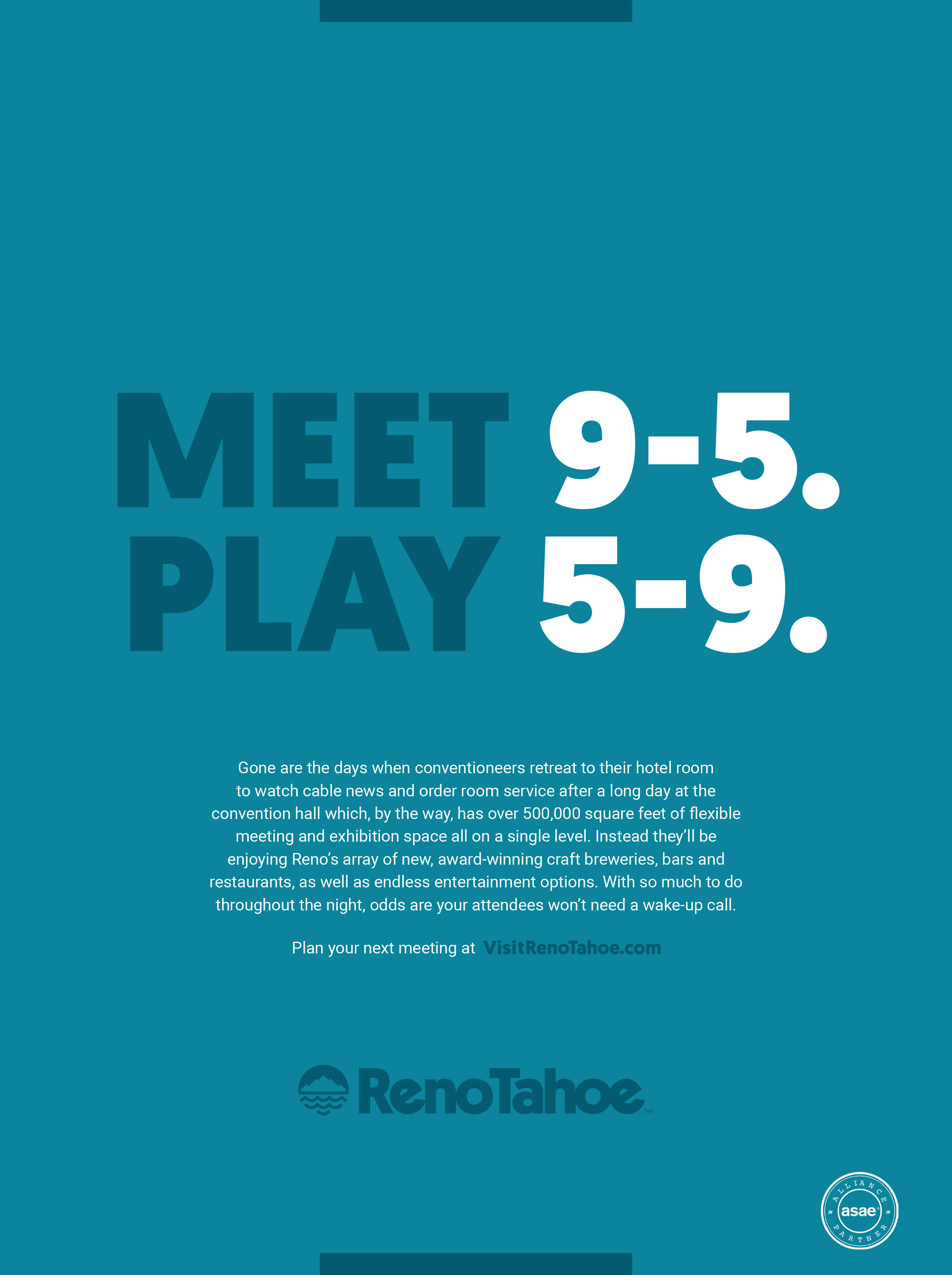
Reno Tahoe is a place of great contrast. It’s evident in the name itself. This is where the country’s largest alpine lake meets the Biggest Little City in the World. The inherent tension in contrast fuels the energy and ambition of the destination to seize life, act on instinct, and explore infinite possibility. It’s proof that this place lives in refreshing nonconformity. The contrast concept serves as the creative campaign platform that represents Reno Tahoe’s brand value of ambition.
As apart of the team, we collectively created a new look and feel for not only the brand of RenoTahoe but for their advertising moving forward. I developed the logo's icon and identity package with OOH, print, digital takeovers and collateral pieces.